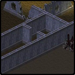
Room Size: For a room to work there has to be a large area of the floor visible. Don't go by realistic proportions when creating a building. Because of the limitations of a fixed isometric viewpoint, rooms must be oversized. The player needs to click on the floor to move their characters so give them plenty of space. For hallways make the visible width at least 3 tiles and rooms should have at least 5x5 tiles visible. If there will be more action happening in a room, then double that to 10x10.

Light Problems: Light entities have many variables that need to be tweaked. First for an interior light, keep the High Bound at 2 units to keep it from leaking through the roof. To keep it leaking through the walls, you are going to have to use a combination of rotation and arc. Angle to rotation so that the direction arrow points away from the wall. The Animation Rotation can be any value from 0 to 8, each increase representing an angle of 45 degrees. Arc should be around 90 degrees but much less than 180 degrees unless you are far from a wall.

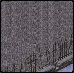
Tile Repetition: A typical ugly mistake the beginner has is to use one tile for a large swath of floor, wall, or roof. The developers were kind enough to include a wide variety of textures so use them to avoid ugly patterns. This will give your map life and make it look realistic. It does take much more effort but the rewards are a better looking map. If you don't want to take the time to individually place different tiles, then make clips from the game maps. Nobody will consider that cheating!
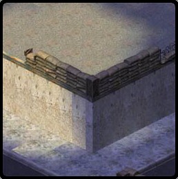
Roof to Wall Matching: Making the roof line up and cover the walls is one of the hardest things to accomplish. If you only line up the edges of the bounding boxes, it won't look right. The best thing to do is to use roof caps which better line up with the tops of the walls. Using only a roof tile will work but then you will have to extend the edge of the roof beyond the walls to cover the top of the walls. It is tricky and it would help if there were roof half-tiles.
Inappropriate Items: Think about the setting of your map and keep it consistent. Will a Hummer fit in a map that has futuristic feel? Are the buildings appropriate for the setting? Don't mix cactus in a landscape that isn't desert.